End-to-End Ownership for 3 Years

BEFORE

AFTER
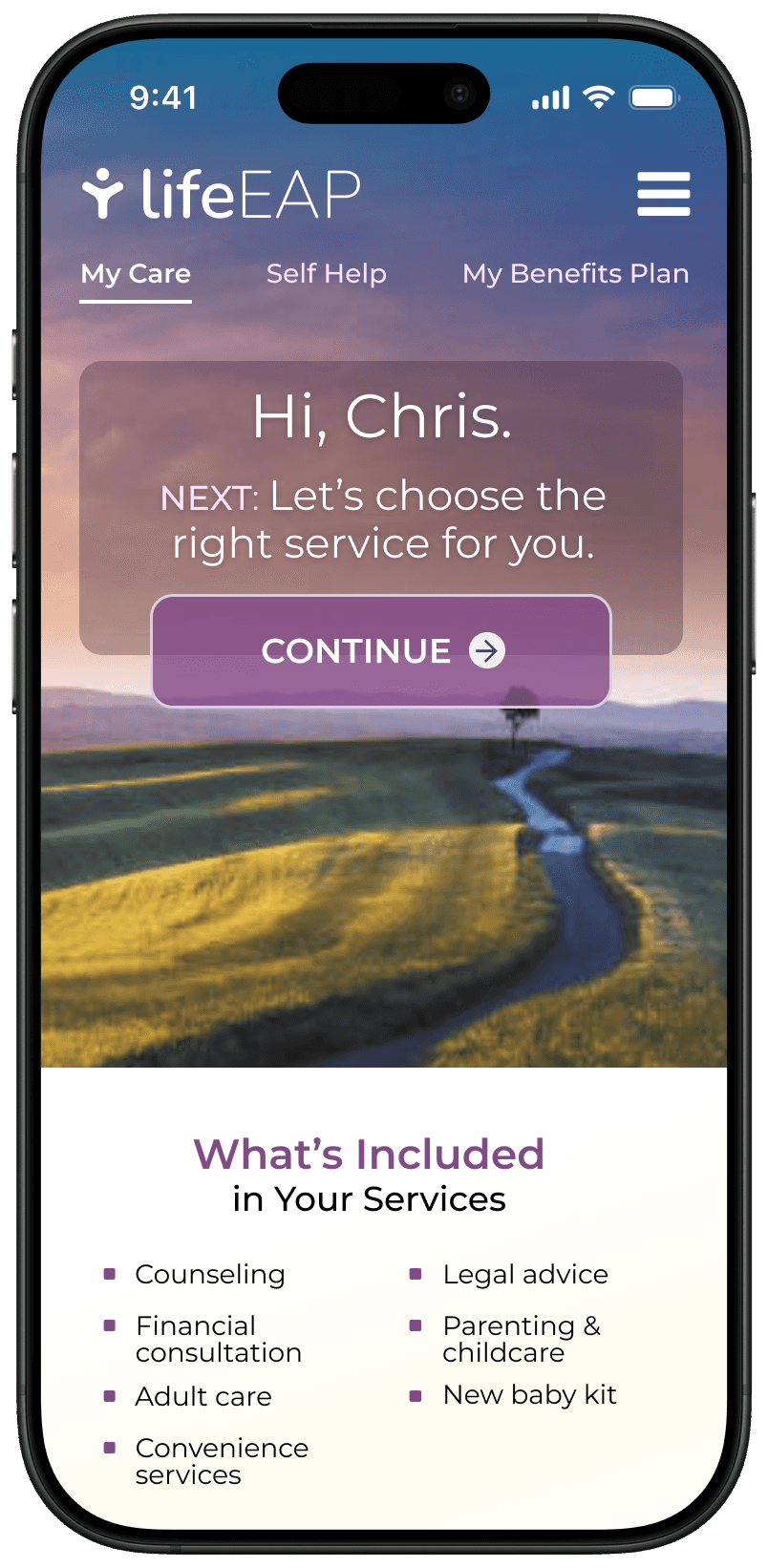

Project Summary
23 minutes
Saved on each enrollment (35m -> 12m) and virtually eliminated enrollment calls.
26% increase
In first-fime conversions, as people no longer had the barrier of making a phone call.
PRIVACY
TRUST
77% increase
In service utilization, taking the company from 2.8% to 4.9% (the EAP industry avg is 3-6%).
A quick look at how it turned out

The problem
Imagine having 10 free mental health counseling sessions, but you can only enroll and pick a counselor over the phone.
It takes privacy (and courage) to explain it out loud. It takes over 30 minutes and it's a serious barrier that many can't overcome.
And if you're the EAP provider paying people to take these calls…
Leading discovery
First, I talked to stakeholders
I held 1:1 interviews with 12 key business leaders to get their perspectives and understand what outcomes they were looking for.
Then, I ran a design workshop
My goal was to kickstart the collaboration and get everyone aligned on scope. I led ideation and an activity to prioritize the features/stories.
UX Guiding Principles
I defined these principles to guide our design coming out of discovery.
Design for Calm
Clean, soothing colors, warm tone
Judgement-Free Zone
Emphasize privacy and build trust
Get In, Get Out
Get people matched and on their way
Satisfy (and lead) the curious
Help people discover what they need
Illusion of control
Show we're listening with tailored guidance
Demystify the services
Spell things out for our people
Show Momentum
Turn progress into something real
Engagement Matters
More utilization = more business
Next, it was time to test some concepts to see what resonates
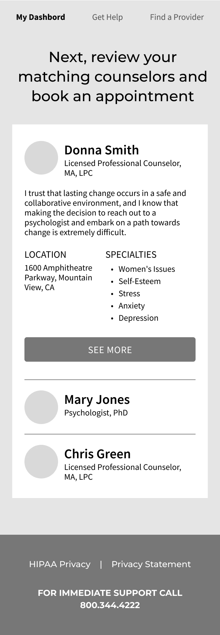
I conducted three rounds of iterative concept validation with 10 users, working in low fidelity, where I can focus on features and functionality.


Designing the solution
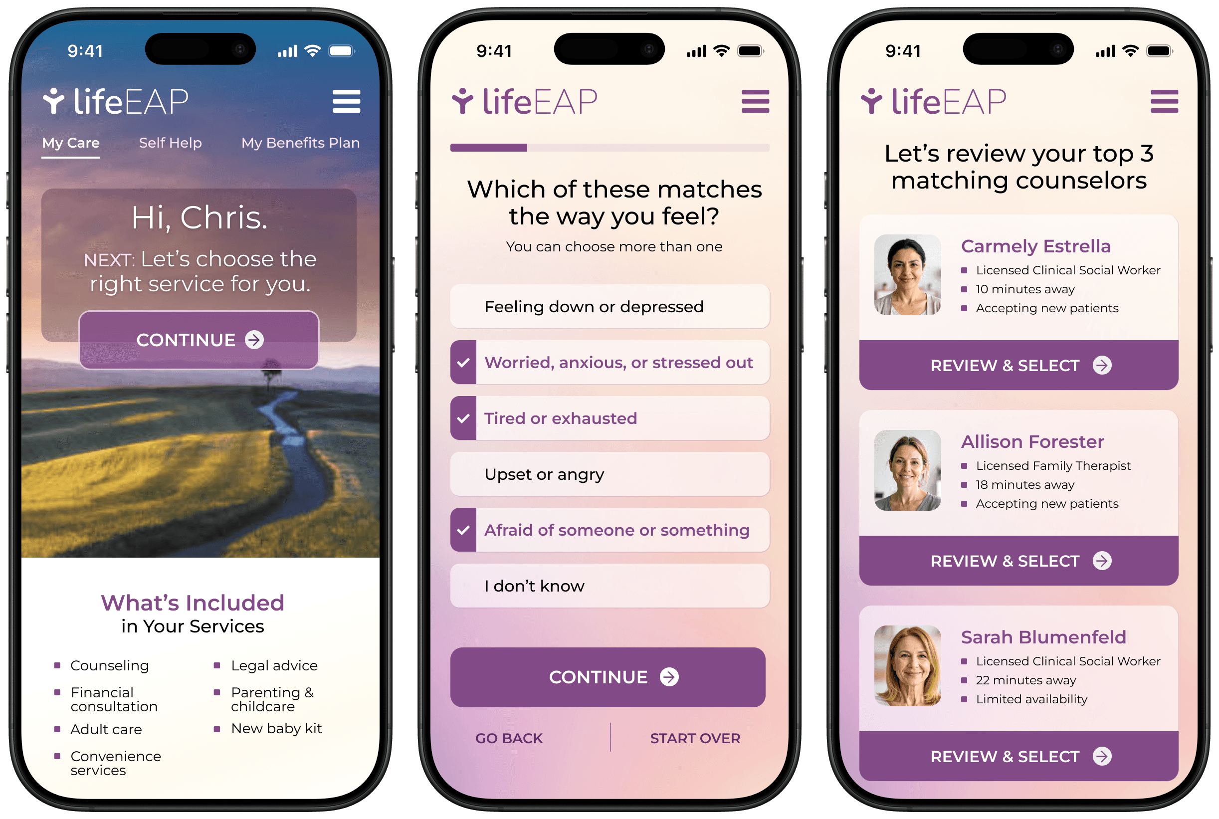
This was a mobile-first design to give people a convenient, private experience
Although I'm not showing them here, this was a responsive-web product, so there are desktop views.
PAIN POINT: Long phone call to enroll (no privacy)
UX STRATEGY
Frictionless digital enrollment
Pathway to services with no pressure or judgment
Top-3 counselor matches based on intake
Ability to pick your own counselor


PAIN POINT: Feeling overwhelmed during crisis
UX STRATEGY
Soothing color palette
Step-by-step help with warm language
Simplified actions and components
Clean design with consistent structure


PAIN POINT: Action Plan that really wasn’t helpful
The MVP release included an “Action Plan” feature that fell short of expectations.
UX STRATEGY
"Learning Pathways" within Self-Help
Short videos and articles on subtopics
Progress indicators that show completed tasks
More personlized pathways to explore


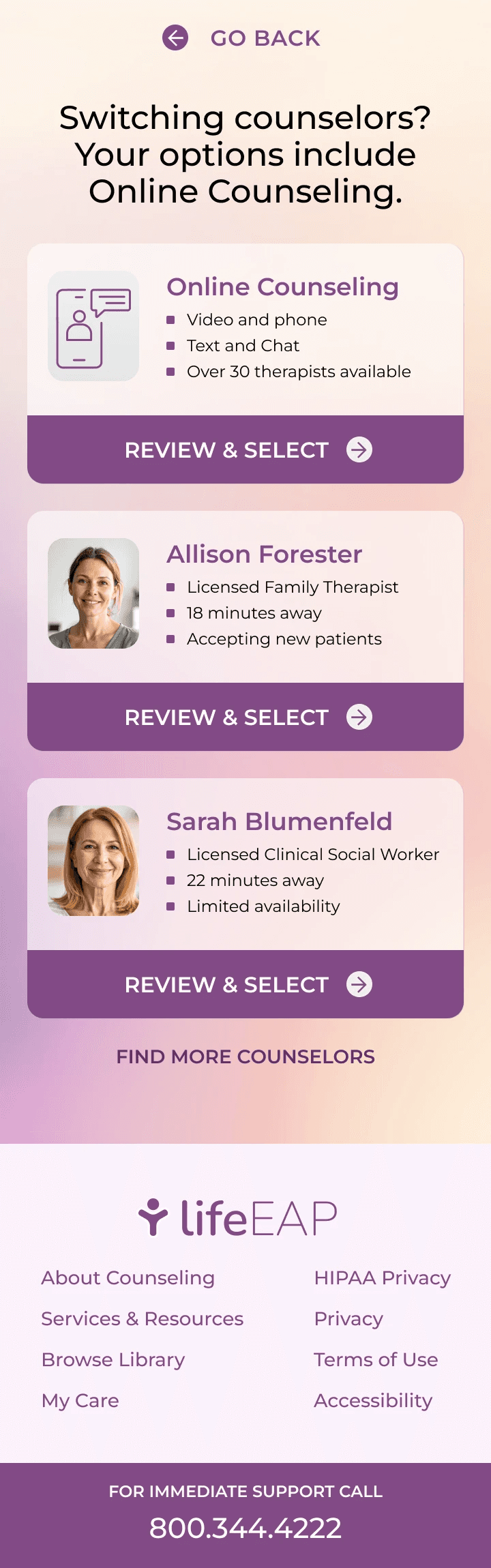
PAIN POINT: Third-party integration led to confused users
The company partnered with a third-party provider of online counseling, but the provider offered no customization to make the transition seamless. Even worse, their user experience was poor.
UX STRATEGY
There really wasn’t a good solution. All we could do was prepare the user before redirecting them.

Live Figma prototypes
These are the prototypes that I used for concept testing (low-fidelity) and for product demos (high-fidelity). Feel free to give them a test drive.
LoFi Concept Prototype
Final Prototype
Results and Impact

26%
increase
In First-Time Conversions, since employees no longer have to make a phone call. And call volume is lower.
77%
increase
In Service Utilization, taking the company from 2.8% to 4.9% (the EAP industry average is 3-6%).

© 2026 Brad Marcum. All Rights Reserved.