UX CASE STUDY
UX CASE STUDY
Behavioral Health Mobile Experience
UX + UI Design
Mobile-First
SaaS
Behavioral Health
B2B

As a Senior Design Lead, I transformed a time-consuming, manual process into a mobile-responsive platform that slashed enrollment time by 68%.
As a Senior Design Lead, I transformed a time-consuming, manual process into a mobile-responsive platform that slashed enrollment time by 68%.
BEFORE

30+ minute phone call
No flow / Granular /
Not optimized for an executive
AFTER
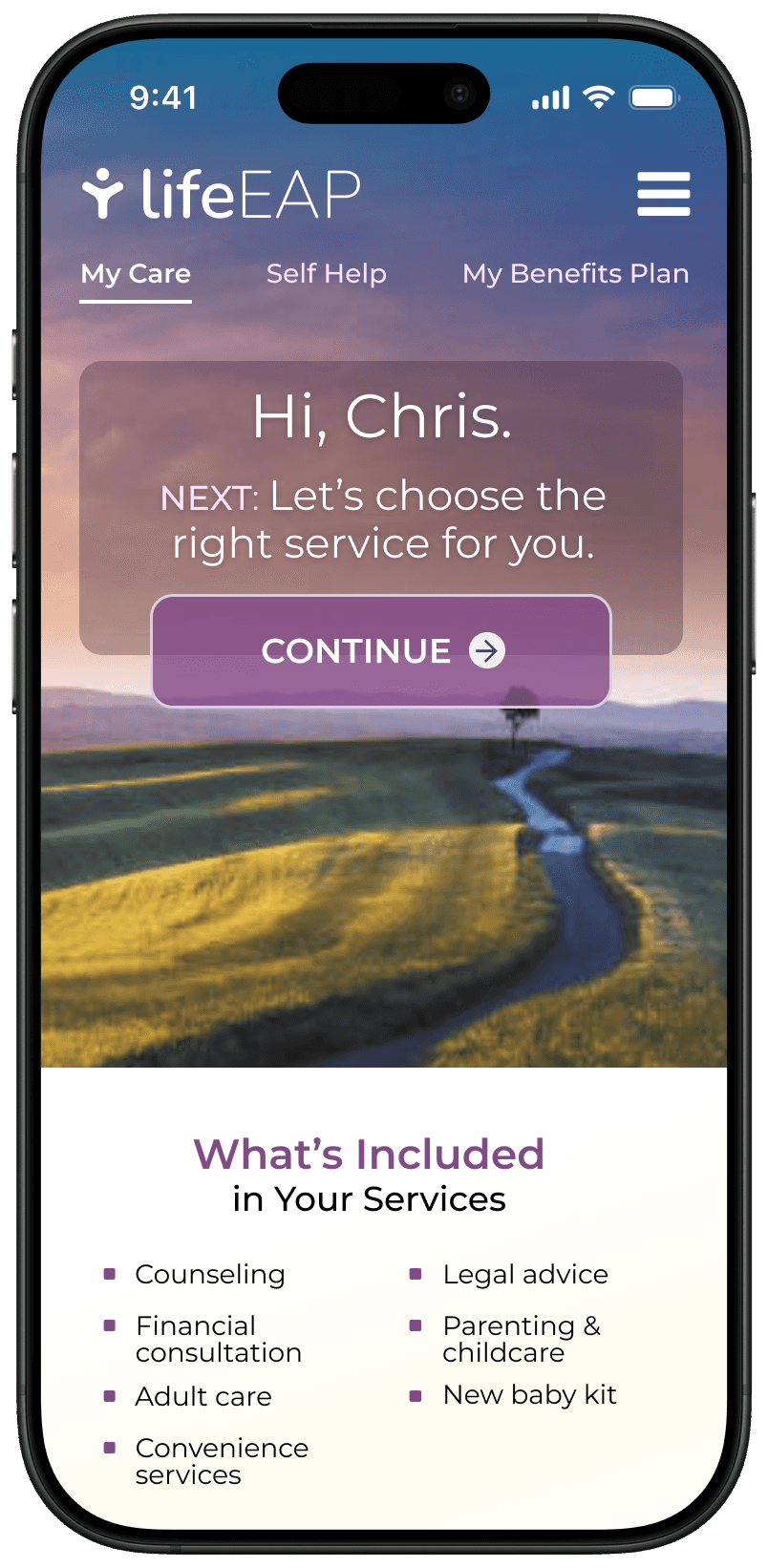

Digital, private, and stress-free
Contextual / Personalized /
AI-enhanced / Mobile
Project Summary
23 minutes
Saved on each enrollment (35m → 12m) and virtually eliminated enrollment calls.
26% increase
In first-fime conversions, as users no longer had the barrier of making a phone call.
PRIVACY
TRUST
A digital experience gives users the privacy they want, leading to higher trust.
A digital experience gives users the privacy they want, leading to higher trust.
77% increase
In service utilization, taking them from 2.8% to 4.9% (the EAP industry average is 3-6%).
Client
Client
Silicon Valley EAP Provider
Top 5 Global Pharma
Timeline
Timeline
Total engagement was 3 years
Total engagement was 3 years
THE TEAM
THE TEAM
Sr. Design Lead ME
Project Manager
Project Manager
Sr. UX Researcher
Sr. UX Researcher
Client Partner
Client Partner
Product Manager
Product Manager
3-Person Dev Team
3-Person Dev Team
KEY DESIGN ACTIVITIES
KEY DESIGN ACTIVITIES
User Research
User Research
Concept Validation
Concept Validation
UI / Visual Design
UI / Visual Design
UX Strategy
UX Strategy
Interactive Prototyping
Interactive Prototyping
Design QA
Design QA
The problem
Imagine having 10 free mental health counseling sessions, but you can only enroll and pick a counselor over the phone.
It takes privacy (and courage) to explain it out loud. It takes over 30 minutes and it's a serious barrier that many can't overcome.
And if you're the EAP provider paying people to take these calls…
It's time consuming
It's time consuming
It's costly
It's costly
And your biggest customers are checking out the competition
And your biggest customers are checking out the competition
I started by listening
I started
by listening
1
My researcher and I interviewed 12 stakeholders (who are also end-users).
My researcher and I interviewed 12 stakeholders (who are also end-users).
2
I distilled the findings into 3 UX Personas and 7 Guiding Principles.
I distilled the findings into 3 UX Personas and 7 Guiding Principles.
3
I wrapped up discovery by leading an 8 hour co-design workshop.
I wrapped up discovery by leading an 8 hour co-design workshop.



Architecting the user experience
Architecting the user experience

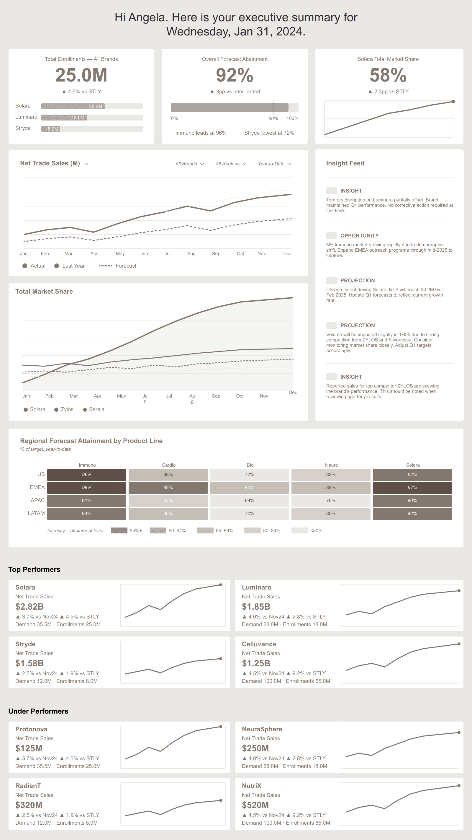
Concept 1 was a traditional dashboard with AI as a feed. Some things resonated, but overall it was not effective.

Concept 2 was a side-by-side layout with AI Insights by product line. Better than Concept 1, but not by much.

Concept 3 was a top-down flow with contextual AI Insights baked-in. This was the clear winner.
Concept 1 was a traditional dashboard with AI as a feed. Some things resonated, but overall it was not effective.
Concept 2 was a side-by-side layout with AI Insights by product line. Better than Concept 1, but not by much.
Concept 3 was a top-down flow with contextual AI Insights baked-in. This was the clear winner.
Concept 1 was a traditional dashboard with AI as a feed. Some things resonated, but overall it was not effective.
Concept 2 was a side-by-side layout with AI Insights by product line. Better than Concept 1, but not by much.
Concept 3 was a top-down flow with contextual AI Insights baked-in. This was the clear winner.
Concept 1 was a traditional dashboard with AI as a feed. Some things resonated, but overall it was not effective.
Concept 2 was a side-by-side layout with AI Insights by product line. Better than Concept 1, but not by much.
Concept 3 was a top-down flow with contextual AI Insights baked-in. This was the clear winner.
After testing three concepts it was clear that the storytelling concept was the most effective approach.
After testing three concepts it was clear that the storytelling concept was the most effective approach.
It leads with summary, flows into brand performance, and finishes with drivers of brand performance.
It leads with summary, flows into brand performance, and finishes with drivers of brand performance.
TRADEOFF: NARRATIVE vs NAVIGATION
TRADEOFF: NARRATIVE vs NAVIGATION
Tab-driven navigation feels familiar, but for users the contextual flow was worth the tradeoff.
Tab-driven navigation feels familiar, but for users the contextual flow was worth the tradeoff.
Overcoming the challenges
Overcoming the challenges
UNDEFINED AI
UNDEFINED AI
Everyone wanted AI, but nobody could tell me what it should actually do.
Everyone wanted AI, but nobody could tell me what it should actually do.
I had no defined outputs
No existing use-cases
And no real examples in pharma
I had no defined outputs
No existing use-cases
And no real examples in pharma
To give people something to react to, I designed a framework with Projections, Opportunities, and Insights. They loved it.
To give people something to react to, I designed a framework with Projections, Opportunities, and Insights. They loved it.
A GOOD IDEA AT THE WRONG TIME
A GOOD IDEA AT THE WRONG TIME
A stakeholder pitched a metric called the "Evolution Index." I liked it, but:
A stakeholder pitched a metric called the "Evolution Index." I liked it, but:
It wasn't being used anywhere
Few users understood it
And leadership wasn't tracking it
It wasn't being used anywhere
Few users understood it
And leadership wasn't tracking it
I decided to push back, suggesting a workshop activity to prioritize the metrics. "EI" didn't make the cut and was added to the backlog.
I decided to push back, suggesting a workshop activity to prioritize the metrics. "EI" didn't make the cut and was added to the backlog.
EARLY MISTAKES
EARLY MISTAKES
Here are two things I'll catch sooner next time:
Here are two things I'll catch sooner next time:
Mistake one: I assumed why a team member was struggling instead of asking and the output reflected it. I should have asked.
Mistake one: I assumed why a team member was struggling instead of asking and the output reflected it. I should have asked.
Mistake two: We tried to visualize data we didn't understand and it slowed us down. I should have pushed for definition earlier.
Mistake two: We tried to visualize data we didn't understand and it slowed us down. I should have pushed for definition earlier.
I rebounded, but both are lessons learned.
I rebounded, but both are lessons learned.


Moving beyond static reporting
Many users told me about two big pain points:
Many users told me about two big pain points:
No strategic insights
No strategic insights
No real-time data
No real-time data
So I made 5 moves to solve it:
So I made 5 moves to solve it:
01
Predictive analytics using AI
02
Chart annotations for key moments
03
Personalized views: executives vs analysts
04
Real-time dashboard to replace static reports
05
Mobile-friendly real-time monitoring
01
Predictive analytics using AI
02
Chart annotations for key moments
03
Personalized views: executives vs analysts
04
Real-time dashboard to replace static reports
05
Mobile-friendly real-time monitoring

This view shows AI-insights, opportunities, and projections, as well as chart annotations. The real-time reporting is highly personalized.
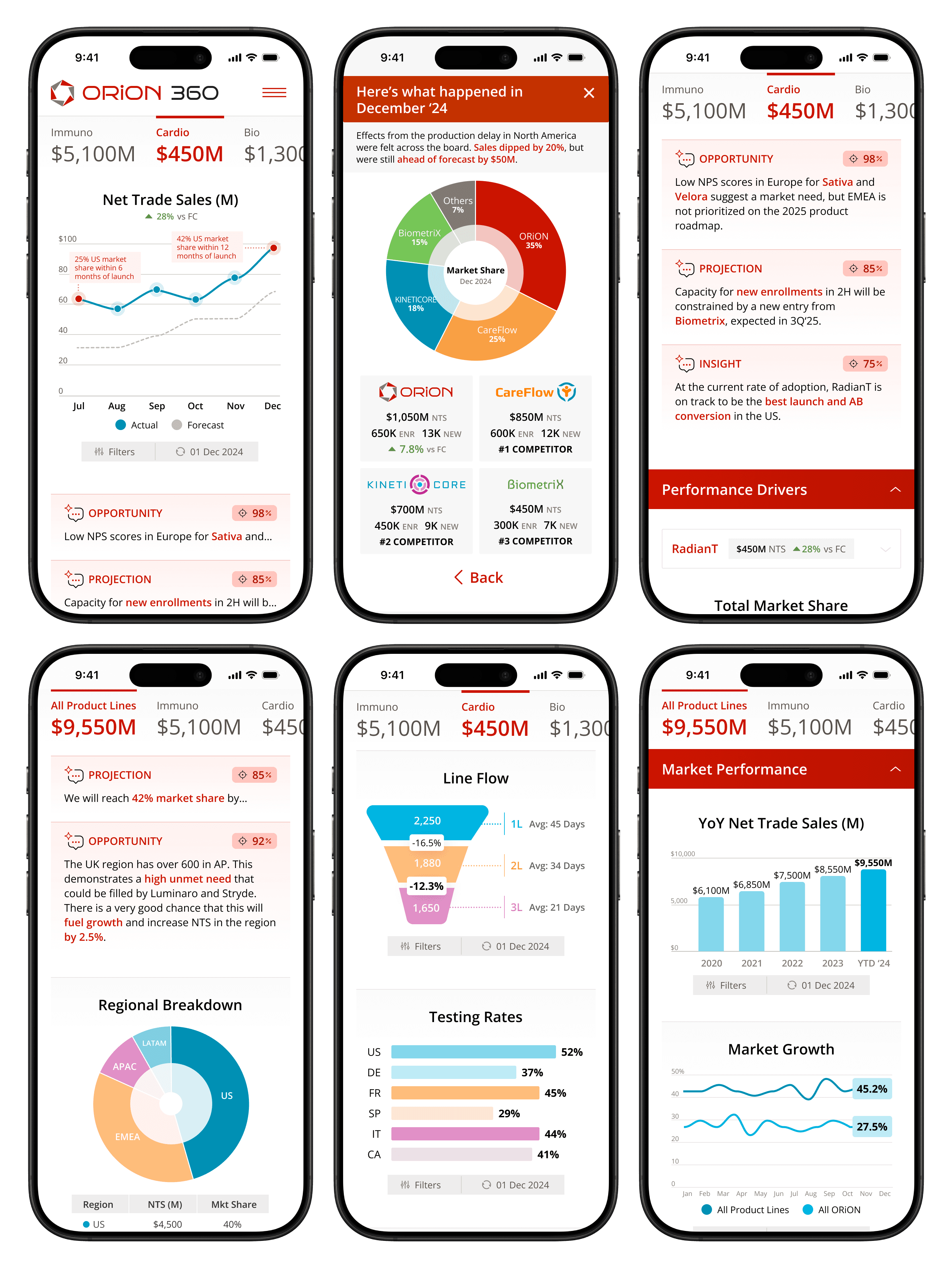
The mobile-friendly UI enables better real-time monitoring and allows users to break free from their powerpoint decks.
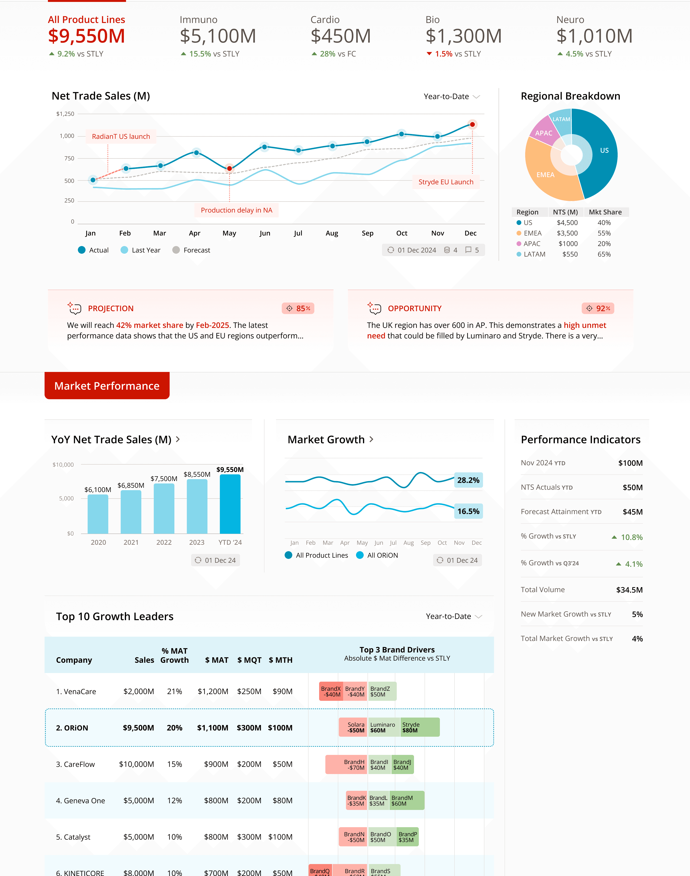
A view optimized for executive users provides high-level, real-time data with predictive analytics that enable better decision-making.
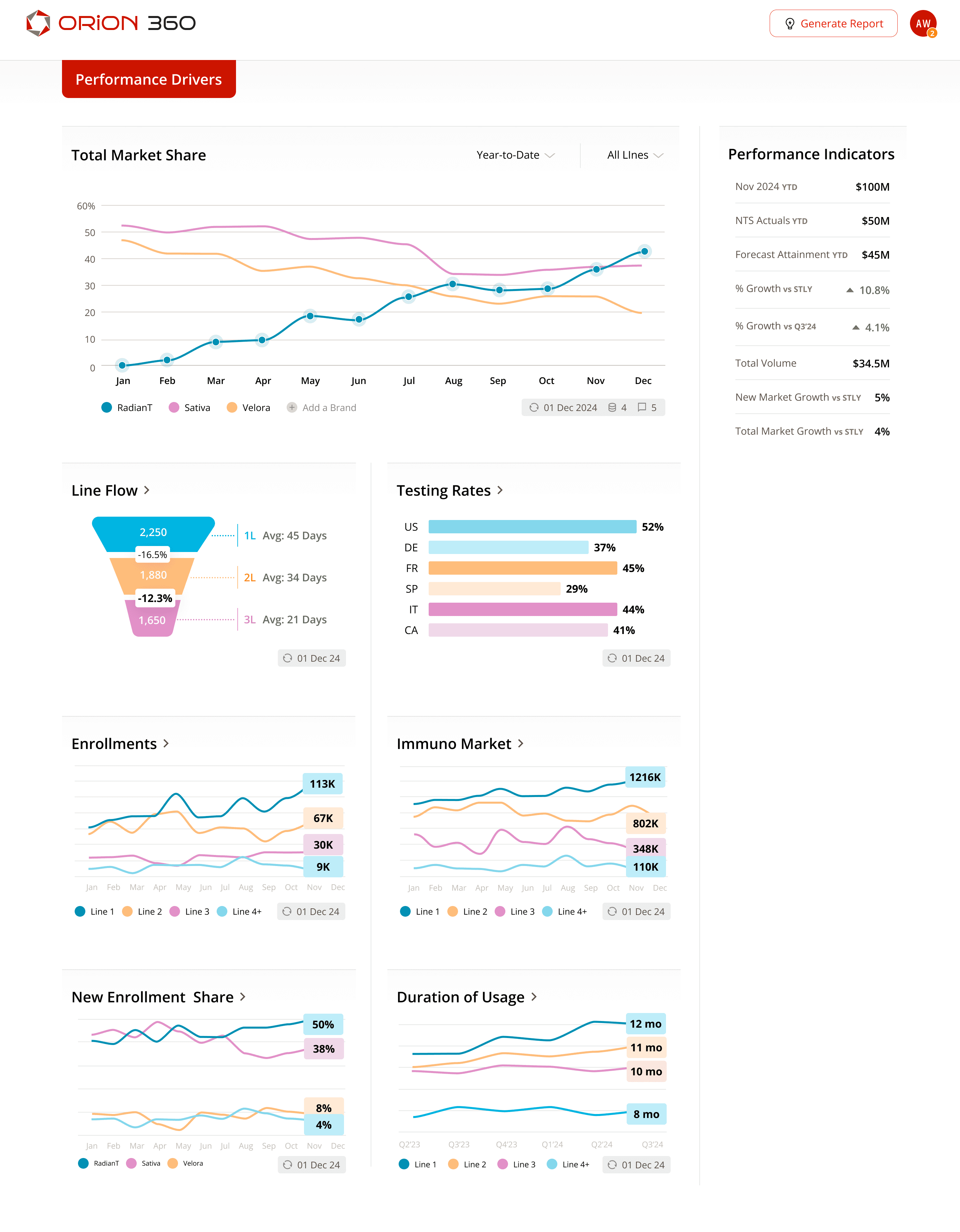
The real-time metrics here are personalized and charts can be repositioned. Analytical details are "sticky" along the right side.
This view shows AI-insights, opportunities, and projections, as well as chart annotations. The real-time reporting is highly personalized.
The mobile-friendly UI enables better real-time monitoring and allows users to break free from their powerpoint decks.
A view optimized for executive users provides high-level, real-time data with predictive analytics that enable better decision-making.
The real-time metrics here are personalized and charts can be repositioned. Analytical details are "sticky" along the right side.
This view shows AI-insights, opportunities, and projections, as well as chart annotations. The real-time reporting is highly personalized.
The mobile-friendly UI enables better real-time monitoring and allows users to break free from their powerpoint decks.
A view optimized for executive users provides high-level, real-time data with predictive analytics that enable better decision-making.
The real-time metrics here are personalized and charts can be repositioned. Analytical details are "sticky" along the right side.
This view shows AI-insights, opportunities, and projections, as well as chart annotations. The real-time reporting is highly personalized.
The mobile-friendly UI enables better real-time monitoring and allows users to break free from their powerpoint decks.
A view optimized for executive users provides high-level, real-time data with predictive analytics that enable better decision-making.
The real-time metrics here are personalized and charts can be repositioned. Analytical details are "sticky" along the right side.
Moving beyond static reporting
Designing for trust

Users also mentioned two other significant pain points:
Users also mentioned two other significant pain points:
They couldn't trust the data
They couldn't trust the data
No context to explain "why"
No context to explain "why"
So I made 5 key design decisions:
So I made 5 key design decisions:
01
01
Tell the story behind the data
Tell the story behind the data
02
02
Be transparent with dates & sources
Be transparent with dates & sources
03
03
Include commentary
Include commentary
04
04
Leverage AI to explain context
Leverage AI to explain context
05
05
Show correlations in the data
Show correlations in the data
In the end there was less work, more trust, and faster decision-making.
In the end there was less work, more trust, and faster decision-making.

The client now saves 84 hours in prep time every month…
Less errors and inconsistencies
Less work
validating data
Personalized
metrics
Automated PPT slides
The client now saves 84 hours in prep time every month…
Less errors and inconsistencies
Less work
validating data
Personalized
metrics
Automated PPT slides

The new dashboard unifies their reporting and simplifies their workflows…
7
Products
4
Global Regions
4
Reporting Platforms
12
Data Sources
50
Data Points
32
Charts

The new dashboard unifies their reporting and simplifies their workflows…
7
Products
4
Global Regions
4
Reporting Platforms
12
Data Sources
50
Data Points
32
Charts

And leadership can now make faster, more confident strategic decisions.
A single source of truth
Real-time visibility and transparency
Predictive analytics via AI
Competitive market dynamics
And leadership can now make faster, more confident strategic decisions.
A single source of truth
Real-time visibility and transparency
Predictive analytics via AI
Competitive market dynamics
Let's connect!
Let's connect!

Direct contact info
Direct contact info
919.397.4778
919.397.4778
bmarcumux@gmail.com
bmarcumux@gmail.com
Raleigh-Durham, NC
Raleigh-Durham, NC
© 2026 Brad Marcum. All Rights Reserved.