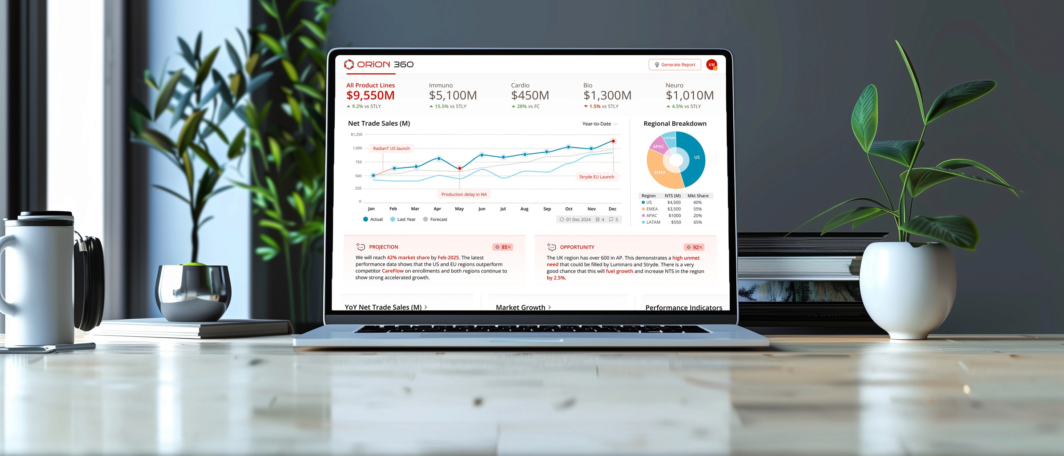
Partnering with a Top 5 global pharma company, I led the creation of an AI-driven performance dashboard, unifying complex data into a cohesive story for leadership.
BEFORE

No flow / Granular / Not optimized for an executive
AFTER

Contextual / Personalized / AI-enhanced / Mobile
84 Hours
Eliminated each month in prep work for reporting decks
32 / 50
32 charts and 50+ data points unified into a single source of truth
PROJECTIONS
INSIGHTS
OPPORTUNTIES
Faster, more confident strategic decisions via predictive analytics
$0 Cost Overrun
On-time and on-budget
Top 5 Global Pharmaceutical
Design Lead (Me)
Senior Strategist
Product Owner
Product Manager
Senior Designer
UX Researcher
User Research
Concept Validation
UI / Visual Design
Co-Design Workshop
Interactive Prototyping
The problem
Every month, highly-paid strategists and managers spent several days building slides for leadership.
Confidence in the data had eroded. Nobody could be sure they were comparing apples to apples.
There was no single place to go...
4 outdated reporting platforms
12 fragmented data sources
First, I listened
1
My researcher and I started by interviewing 12 stakeholders (who were also the end-users).
2
With some solid data, I came up with 3 UX Personas and 7 Guiding Principles that we could rally around.
3
I concluded discovery by leading an 8 hour co-design workshop with the client.


During testing it was clear that the storytelling concept would be the most effective for helping the user understand what is happening and why.
TRADEOFF: NARRATIVE vs NAVIGATION
Storytelling came at the expense of tab or menu-driven navigation, which is more familiar for task-driven users. The decision paid off.
It leads with summary, flows into brand performance, and finishes with drivers of brand performance.
Every answer is where the question naturally arises.
Overcoming the challenges
UNDEFINED AI
Everyone wanted AI in the product, but nobody could tell me what it would look like.
I had no defined outputs
There were no existing use-cases
And no real examples in pharma yet
Sometimes people don't know what they want until they see it, so I built a framework of what I thought AI could provide: Projections, Opportunities, and Insights.
Next I did some research and weaved a few AI examples into the design. Now people had something to react to (it was good).

A GOOD IDEA AT THE WRONG TIME
A stakeholder proposed a forward-thinking metric called the "Evolution Index", which I was optimistic about, however:
It wasn't in any existing reports
Very few users know what this is
Leadership wasn't tracking it
As much as I liked the idea, I ultimately decided to push back. Instead, I proposed a workshop activity where the group votes on what metrics to prioritize.
This was one of several product decisions that I made. I made sure the design was scalable, so we could add the new metric when the time was right.

EARLY MISTAKES
Early work was "just okay". I wish I had caught two things earlier:
Mistake one: I assumed why a team member was struggling instead of asking and the output reflected it. I needed to ask before assuming.
Mistake two: We tried to visualize data we didn't yet understand and it slowed us down. I should have have pushed for definition earlier.
Both were process failures that I had to rebound from to get us back on track. Lesson learned.

Leveraging AI
Two key pain points were the lack of real-time results and strategic insights.
All they had were last-month’s slides.
I decided on 4 ways to give people the ability to act on real-time signals:
01
Predictive analytics with AI
02
A top-notch mobile experience
03
Highly personalized results
04
A flow that matches their mental model


Designing for trust

Two additional pain points that came from users were:
Lack of trust in the data
No context for the numbers
To tackle this, I made 5 key design decisions:
01
Tell the story behind the data
02
Be transparent with dates & sources
03
Include commentary
04
Leverage AI to explain context
05
Show correlations in the data
In the end, there was faster decision-making, more confidence, and less Powerpoint.

The client now saves 84 hours in prep time every month…
Less errors and inconsistencies
Less work
validating data
Personalized
metrics
Automated PPT slides